So today in class Greg showed us all an interesting animation clip from Dust Echoes called Mermaid Story. It had no dialogue, just background instrumental music to highlight the story that was being portrayed within the clip. The animation was a little abstract. Like something Tim Burton would create. But the message behind the story was good. Greg explained that along with these stories are synopses, study guides, lesson plans and activities based upon them, however, the slips need to be suitable for the age they are being shown to as some can be quite emotive.
We then were able to get onto the Dust Echoes site and explore the site's detail.

http://www.abc.net.au/dustechoes/
After lots of time and hard work I was able to create a diagram display using Inspiration based upon one of the dreamtime stories. I chose The Curse story. Here is a picture of the diagram I created:
I'm pretty stoked with my ability to create things within such a minimal time frame. I checked out what others had done as well and they are all really good! I would definitely use this activity in a classroom situation. You could do it with any topic, it's great!
I am aware that in VELS level 4, indigenous studies becomes a topic from the Humanities strand. Knowing this site is available, this would be an effective/ educational resource to expand students knowledge into the concept, particularly in relation to The Dreamtime.
No time to relax, moving on to the next thing... M&Ms!!

Oh No! I think we're going to be using EXCEL! I do not have a lot of knowledge with regards to using this program, compared to other Microsoft programs such as publisher and powerpoint.
I have to admit though, after scanning through the programs and utilizing the mathematical tools, the graphs that the program can produce from inserted data aren't bad at all!
The ideas Greg is talking about are great in relation to chance and data collection, with also touching on the importance of awareness of food allergies within the classroom, as sometimes the use of M&Ms, although being a fun and delicious form of engagement, in some cases may be a health issue. In this way, other coloured lollies may be appropriate, otherwise coloured counters are always available within the classroom! I have a good knowledge of anaphylaxis and I am really aware of the importance of teaching children about allergies, and applying the information in a graphic way would be really beneficial.
I had no idea that so many educational domains could be applied when referring to M&Ms! Maths, Literacy, Interpersonal Learning and even Science (design and development)
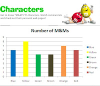
Anyway, this is the graph I created defining the number of different coloured M&Ms in a pack:

I love it!! And I am so surprised at how easy it was to create! I think creating a graph this way is a quicker, easier and more coherent way of expressing data visually. All you need to do is insert in the data into the different rows, label the row, then select Graph and from there you can use a range of formating tools to present the data colourfully, in any style of graph you choose. I chose to create a bar graph as I find these the easiest to read.
I think children would really benefit from being able to produce a graph in this format, as rather than them focussing most on manually colouring in a tangible graph, they can quickly create one and analyse the data straight away, which will also ehance their knowledge and skills of ICT.
No comments:
Post a Comment